Secrets behind the world’s most famous food packaging
Unwrapping the secrets of iconic food packages
From Coca-Cola’s bulbous bottle to Toblerone’s triangular sleeve, great packaging can turn everyday products into timeless icons. As well as serving the essential purpose of containing the food or drink, it can influence shoppers' purchases – and, in some cases, remains unchanged for decades. Here, we look at how some of the world's most famous food branding and packaging came about.
Click or scroll through our gallery to discover the amazing stories behind the world’s most iconic food packaging.
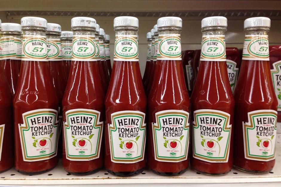
Heinz Tomato Ketchup
If you’ve ever found yourself violently shaking a bottle of Heinz Tomato Ketchup, willing the sauce to come out, you’ve probably wondered why it was made this way. Despite its shortcomings, the glass bottle, patented in 1882, was carefully designed: the smooth neck is supposed to ensure a steady stream of ketchup, while the octagonal base makes it comfortable to hold. The transparent glass was important too: the quality of commercial ketchup was often called into question, and Heinz wanted to showcase the purity of its product. Even now, with plastic squeezy bottles available, many opt for this nostalgic version.
Coca-Cola
The original red-label Coca-Cola bottle – with its contours and fluted lines – is unmistakable, and the soft drinks company had marketing goals in mind from the very start. The bottle was designed by the Root Glass Company of Indiana, which was told to ensure that the bottle should be recognisable in the dark or if it was broken. Even the choice of name was bound up with design; the two Cs, written in scrawling Spencerian script, were intended to catch consumers' attention, as was the bold red colour.
Kellogg’s Corn Flakes
It's hard to imagine Kellogg's Corn Flakes' packaging without its signature cockerel, but the bird didn't actually grace boxes until the 1950s. There are several reasons for its introduction. First, a friend of founder W. K. Kellogg apparently noted that the Welsh word for rooster is 'ceiliog' (which sounds very similar to Kellogg) and, of course, the bird is nature's answer to the alarm clock. Cornelius (the bird's affectionate nickname) was splashed across boxes in bold primary colours and has remained there ever since.
Nissin Cup Noodles
When Cup Noodles launched in post-war Japan, they symbolised modernity, and the packaging was all about functionality. Created by Japanese entrepreneur Momofuku Ando, the founder of Nissin Foods, Cup Noodles were dreamt up after a trip to the US, where Ando saw Americans prepare dried ramen in cups with boiling water. For the packaging, a portable plastic foam cup was placed around the dried noodles, drawing in customers with a bright red font and gold bands inspired by fine china.
Huy Fong Foods Sriracha
Often referred to as rooster sauce, Huy Fong Foods Sriracha has an interesting packaging-design story. The company name comes from an old Panamanian freighter, Huey Fong, which carried founder David Tran and other refugees away from war-torn Vietnam. Meanwhile, the rooster, the company's logo, is Tran's zodiac animal. The rooster was drawn for him by a Vietnamese street artist in the 1970s, and although the original was lost, he got a larger, sharper version recommissioned in the US in the 1980s.
Spam
Arguably, Spam comes in an opaque tin since, before it's fried, the processed meat might look less than appealing. However, the little blue pop-top tins do much more than hide what’s within. Spam comes in a can because the meat is cooked inside, under vacuum pressure, so it lasts a very long time. Its name, apparently a combination of the words 'spice' and 'ham', is bold and marketable too.
Lyle's Golden Syrup
Lyle’s Golden Syrup is famous for being Britain’s oldest brand, and for having the world's oldest unchanged packaging. The logo – depicting a lion, who appears to be sleeping but is actually deceased, surrounded by bees – depicts the story of Samson from the Old Testament, and has remained identical since 1883. That is, until the brand controversially announced in February 2024 that they would be swapping the image for a less grisly alternative on most of its packaging. Thankfully, the rebrand excludes the classic gold and green tin, so the legacy lives on.
Pringles
Thinking outside the box (or bag), Pringles uses the cylindrical shape of its packaging to grab customers’ attention. But the packaging was originally dreamt up for practical rather than aesthetic purposes. The canister was created by chemist Fredric J. Baur while attempting to develop crisps that don’t break in the bag. Pringles Newfangled Potato Chips were released in the 1960s.
Toblerone
Most might assume that Toblerone’s triangular packaging was inspired by the Matterhorn mountain in the Alps, right on the Swiss-Italian border – there's an image of it on the box, after all. However, other sources claim it was the dancers at the Folies Bergère cabaret hall in Paris that influenced the design: dancers formed a human pyramid during the show, and co-founder Theodor Tobler was in awe of the scene. Regardless, the packaging remained fairly consistent, with its gold background and red writing, from 1908, though the mountain logo is to be dropped as the majority of production moves outside Switzerland.
Lindt Gold Bunny
The appearance of the Lindt Gold Bunny in stores, with its little bell and red ribbon, is a sure-fire sign that Easter and the start of spring are just around the corner – and there's a reason that its packaging is so realistic, whiskers and all. The idea came from a Lindt chocolatier, whose daughter desperately wanted a real-life bunny to play with. Her father came up with the next best thing, and it was so popular that it reached global markets by the 1990s.
Planters Cocktail Peanuts
In the early 1900s, playful peanut brand Planters used semi-transparent bags not only to keep its product fresh but also to show customers exactly what they were getting. The charismatic company mascot, Mr Peanut, is more than a century old too. He was born from a branding competition won by young schoolboy Antonio Gentile in 1916, and his smart top hat, cane and monocle were added by an artist later. By 1928, as technology improved, the signature vacuum-sealed blue can was introduced.
Lea & Perrins Worcestershire Sauce
See the orange label and you'll instantly recognise this product as the tangy British sauce that every household has somewhere in the cupboard. When they were first manufactured and shipped to the US in 1839, the glass bottles were wrapped in paper to protect them during their long journey. Even today, the tradition remains – and the current design, featuring an image of Mr Lea and Mr Perrins on each top corner, retains a vintage look.
Kikkoman Soy Sauce
This sleek bottle, designed by Japanese food manufacturer Kikkoman in 1961, took three years and 100 prototypes to produce. It features a wide base for stability, a narrow neck, and a red plastic cap that stops you from pouring out too much sauce at a time. The clean gold lettering and unbusy design finish the look.
Pillsbury Crescent Dough
When you see this blue tube, you know that freshly baked biscuits or croissants are no more than a few minutes away. The technology for refrigerated dough was developed by Lowell Armstrong and Lively B. Willoughby for Ballard & Ballard Co. of Louisville in the 1930s. However, it was Pillsbury that earned it a place in our hearts with its brand mascot, the Pillsbury Doughboy. The lovable character first appeared on TV in 1965, jumping out of a can and saying: "I’m Poppin’ Fresh, the Pillsbury Doughboy!"
Ben & Jerry’s
Partial to a pint of Ben & Jerry’s ice cream? Then you'll have noticed that whatever the flavour – be it Cookie Dough or Chocolate Fudge Brownie – the packaging bears an idyllic scene of cows grazing on green pastures under a blue sky. The branding was chosen to emphasise the relationship that the company has with its dairy farmers in Vermont, although, in the early days, the farm animals were goofier looking. Their sophisticated new look came courtesy of artist Woody Jackson in 1983.
Tootsie Roll
The wax paper–wrapped sweet, with its chocolatey taste and chewy texture, is less popular than it once was. Yet its brown, white and red packaging, and Cooper Black font, are still instantly recognisable. Tootsie Rolls haven't changed much since they were the first penny candies on sale in 1905 – except they've dispensed with the band that was once wrapped around them (similar to the band found around cigars), which made them a challenge to eat covertly in the classroom.
Quaker Oats
When you have your bowl of oats in the morning, you probably don't stop to consider the history of the cylindrical container, or who the smiling man on the packaging is. Some people believe the dashing chap to be the founder of Pennsylvania, William Penn. However, the brand states that it's simply a man in Quaker garb to indicate good quality and honest value. The packaging also hasn’t always had its eye-catching shape – that came about in 1915.
Kraft Macaroni & Cheese
A symbol of comfort food, blue boxes have been associated with bright yellow, gooey mac ‘n’ cheese since 1937. The founder of Kraft Foods, James Lewis Kraft, got the genius idea to package the ingredients in a single box after seeing a salesman in St Louis sell boxes of pasta with bags of grated cheese attached with a rubber band. Kraft Macaroni & Cheese's colour was initially yellow, but it changed to bold blue in 1954.
Oscar Mayer Wieners
The best-known hot dog brand in the United States has been recognisable by its yellow ribbon since 1929. However, when Kraft Heinz Co. changed the recipe to remove nitrates, preservatives and colours, it took the opportunity to overhaul its packaging. The new look includes a giant hot dog (you can’t miss it) and the words 'No No No'.
Jif
With its colourful red, blue and green label, and its cheerful font, Jif's is one of the most distinctive peanut butter jars around. Its name was chosen because it’s easy to say, spell and remember. Nonetheless, plenty of fans believe it used to be called 'Jiffy' and come in a taller, thinner jar. The brand has denied these claims, attributing the rumour to the Mandela Effect: a phenomenon where a large portion of society remembers something incorrectly.
Green Giant
Green Giant does an excellent job with its branding and packaging. Named after an extra-large variety of pea, the jolly Green Giant mascot, not to mention the idyllic valley depicted on tins, transports customers to a happier place. He first appeared in 1925, but he was so recognisable by 1950 that the Minnesota Valley Canning Company decided to rename itself.
Jif Lemon
In the UK, Jif Lemon is mostly associated with Shrove Tuesday, when it's joyously spritzed onto pancakes – and its packaging is both fun and functional. First appearing in the 1950s, it was manufactured by a new process called blow moulding, and real lemon skin was used to make the textured mould.
Marmite
Love it or hate it, you’ll definitely recognise it. Marmite, a British brand of yeast extract spread, was developed by a German scientist in the late 19th century. It was named after the French cooking pot of the same name, as it was originally supplied in an earthenware vessel that looked similar. Since the 1920s, it has come in a squat black jar with a picture of a marmite pot on its label – an enduring nod to its heritage.
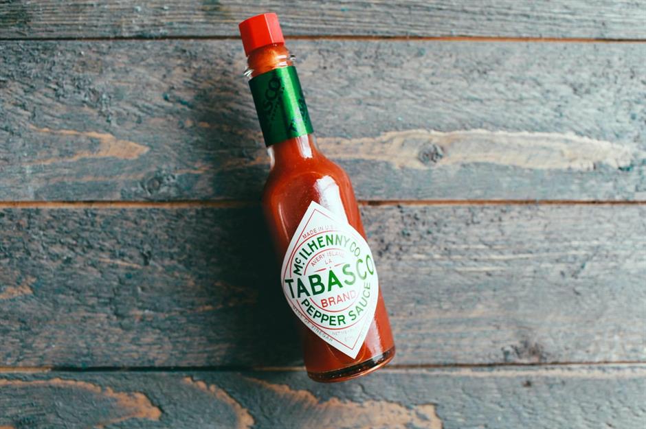
Tabasco Pepper Sauce
The teeny-tiny 2oz (57g) Tabasco bottle has become something of an icon. But, when the Tabasco company got its start in the 1860s, founder Edmund McIlhenny actually used little cologne bottles to package up his product. These cologne bottles had tiny sprinkler fitments that were corked and sealed in wax, and they released the hot sauce one drop at a time – just as it should be. Today, the bold red stopper and green writing is what sets it apart on shelves.
Campbell’s Soup
The red and white Campbell’s Soup can was already iconic before Andy Warhol painted it, but how did its design come about? Company treasurer Herberton L. William came up with the colour scheme while watching a football game between Pennsylvania and Cornell – he was inspired by the bright hues of Cornell's uniform. Breaking up the colours, the medal on the can represents a prize the soup received at the 1900 Paris Exposition. The Campbell's script was inspired by founder Joseph Campbell’s own signature.
Now read about 23 historic food brands that are still going strong