Remember these fast food logos from past times?
Going old-school
Do you long for McDonald's discontinued Tallow Fries, or dream about eating Taco Bell’s long-gone Bell Beefer? There are so many old-school gems that were cut down in their prime, but fast food fans haven’t forgotten them in a hurry. Happily, one restaurant is bringing back some of the beloved menu items you thought were gone forever, putting a gourmet twist on fan favorites from the 1970s onwards.
Click or scroll through our gallery to discover how this nostalgic restaurant is reimagining our lost fast food favorites.
The big comeback
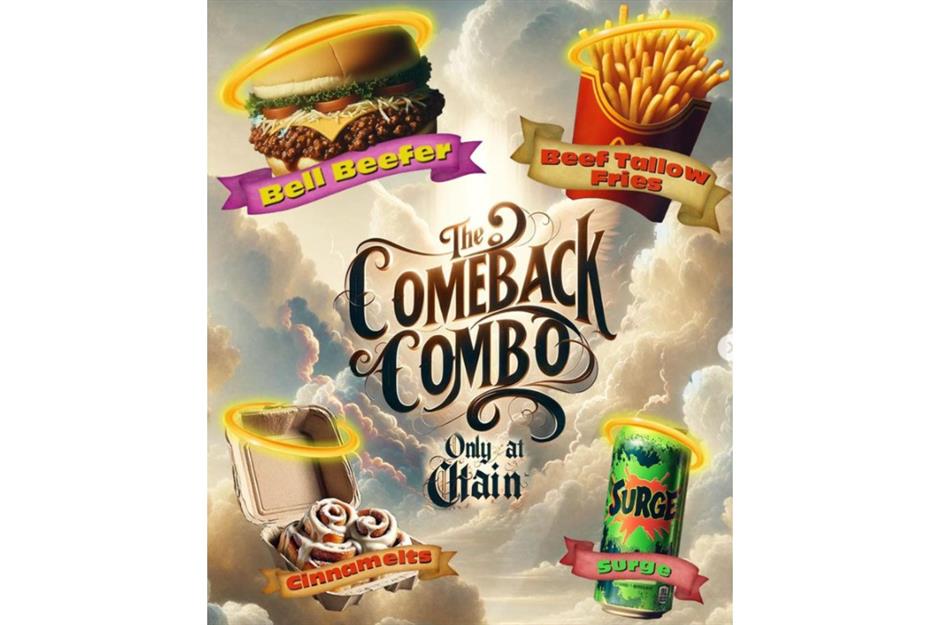
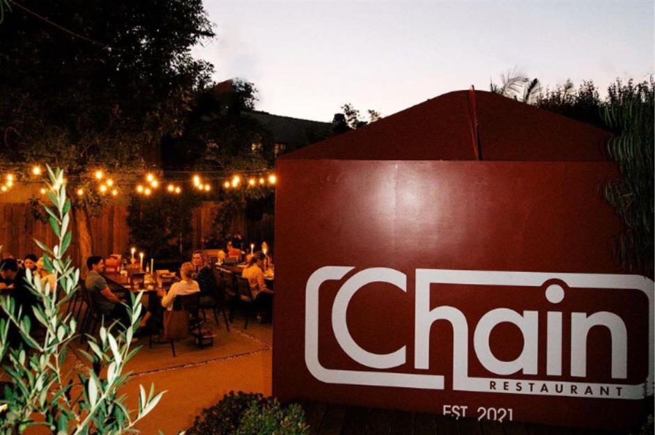
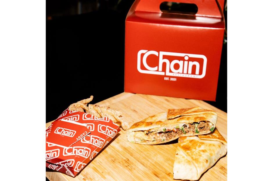
Opened in January 2024, LA-based restaurant Chain is, confusingly, not a chain restaurant. Its name refers to the fast food chains, past and present, that inspired it. So far, Chain – which started as a pop-up before getting a permanent spot in LA’s Virgil Village – has collaborated with Sonic Drive-In, Jack in the Box, Taco Bell, and Pizza Hut. As part of its latest venture, dubbed the ‘Comeback Combo,’ the restaurant asked fans on social media which discontinued fast food items they would like to see revived.
Get them while you can
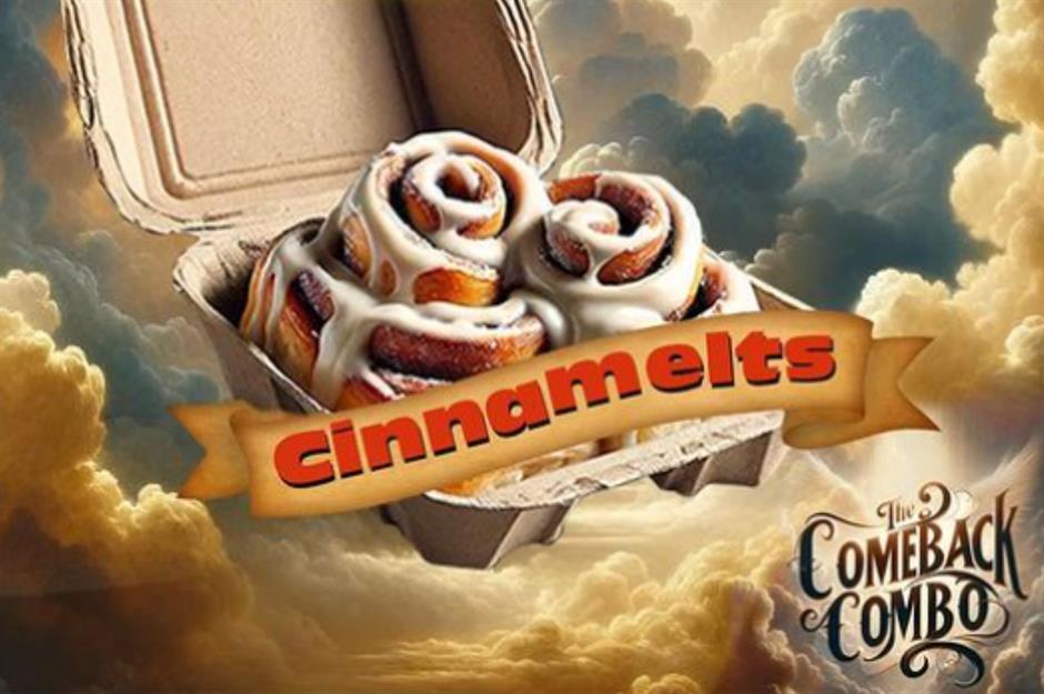
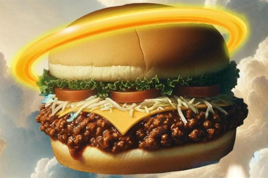
Four items were eventually chosen: McDonald's much-loved Cinnamelts, a popular breakfast item discontinued a few years back, and its Tallow Fries, an old-school recipe from McDonald's original 1940 menu. Back then and until the 1990s, the chain's fries were cooked in beef tallow. The recipe was changed due to heath fears about saturated fats. Also on the comeback list is Taco Bell’s Bell Beefer burger from the 1970s, and Surge, a citrus-flavored soft drink that was launched in the 1990s by the Coca-Cola Company to compete with Pepsi's Mountain Dew.
The hottest ticket in Hollywood
Chain was founded by chef Tim Hollingsworth and actor B.J. Novak, star of NBC’s The Office, whose involvement in the venture has attracted the patronage of Hollywood stars including Mindy Kaling, Chrissy Teigen, and Andy Cohen. Menu items have included riffs on Taco Bell’s Crunchwrap Supreme, Chili’s Southwest egg rolls, and Outback Steakhouse’s iconic Bloomin’Onion. They're certainly onto something – at one point, Chain had a 25,000-strong waiting list. At the founders' connected venture, ChainFest, staged over three days in December 2023 at LA’s Nya Studios, diners feasted on dishes inspired by Pizza Hut, Red Robin, and Jack in the Box.
Retro revival
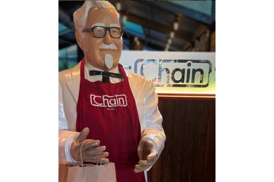
While food is the main attraction, diners also rave about the over-the-top aesthetic of the joint, which is decked out with old-school memorabilia and life-sized statues of retro mascots, from Colonel Sanders to Big Boy’s iconic burger-carrying boy. It’s no surprise Chain looks so good, however. The owners had help from Hollywood production designer Ruth De Jong (whose credits include Yellowstone and Oppenheimer) to help with the interior.
Secret eats
The joint is located in a secret 7,500-square-foot compound in the city’s Virgil Village – diners are only told the exact address once when they have secured a ticket. As you might expect, the decor takes nostalgia to the next level: diners enter through a giant red takeout box and inside are greeted with an arcade, vintage photo booth, Pizza Hut’s iconic stained-glass lamps, and McDonald’s character tables. Much like Chain’s pop-up events, the restaurant has a constant rotation of exciting new menu concepts and collaborators with fast food favorites.
In the mood for some fast food nostalgia? Read on to discover the forgotten logos from America’s most loved chains.
Lost logos

Fast food giants like Burger King and Taco Bell have some of the world’s most recognizable logos, but you’d be shocked to see how different they used to be. McDonald’s was once headed up by Speedee, a chef with a hamburger-shaped head, while Pizza Hut had a quirky mustached mascot named Pete. Then there are the chains that used to be huge but no-longer exist – from Henry’s Hamburgers, with its smiling burger sign, to Howard Johnson’s iconic nursery rhyme-themed logo. Here, we take a look at our favorite retro logos that are no longer used.
A&W
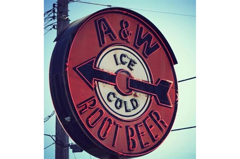
Believe it or not, this striking sign is what was outside A&W restaurants from the 1920s to the 1960s. An orange target with 'A&W' at the top, 'Ice Cold' in the middle, 'Root Beer' at the bottom, and an arrow through the middle. The brand underwent a revamp in 1971, when the retro-looking logo was changed to the sleek orange and brown oval with the restaurant’s initials that we're used to today.
Howard Johnson’s
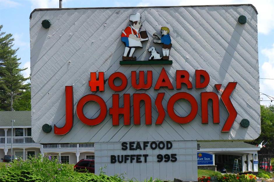
One of the most recognizable logos of all time, now-defunct restaurant chain Howard Johnson’s early branding included the image of Simple Simon and the Pieman. Designed by John Eagles Alcott, it was inspired by a nursery rhyme. You could find it on the sign outside its restaurants, chinaware, glasses, napkins, and placemats.
McDonald’s
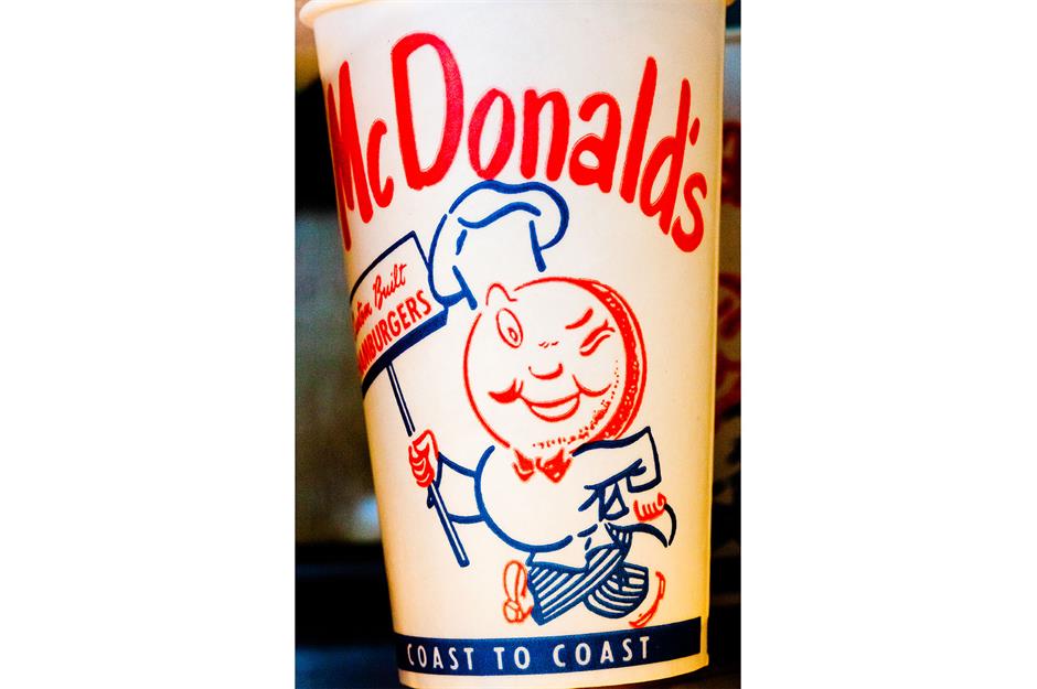
Before McDonald’s adopted the golden arches, it relied on Speedee to signpost it. In the 1950s, its adverts, cups, and packaging featured a slightly sinister chef character whose face was a hamburger. The restaurant name was written out in full above it. It looked suspiciously similar to Henry's Hamburgers' logo, but the fast food giant gave it an update the following decade.
Valle’s Steak House
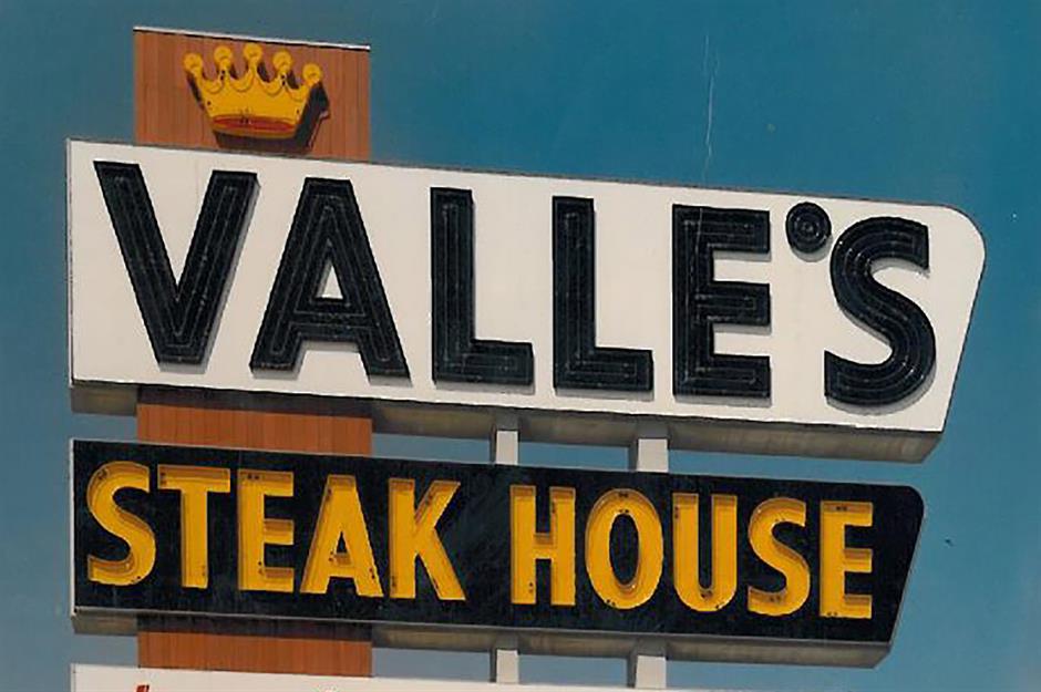
Back in the day, a sign with 'Valle’s' in capital letters and a gold crown perched on top of the 'V' signaled you were nearing a Valle’s Steak House. There were more than 30 on the East Coast, serving a variety of steaks and lobster. It's been closed since the 1990s.
Burger Chef
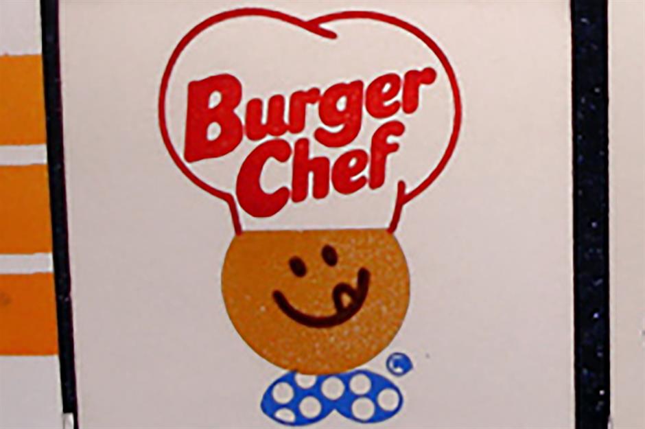
McDonald’s biggest competitor in the 1970s, Burger Chef totaled 1,200 stores across America. In this decade its logo featured a cheery character wearing a polka dot bow tie and a hat that read 'Burger Chef.' Six years later, the face was dropped, leaving just the hat and typography.
Chick-fil-A
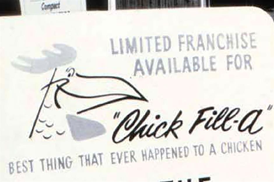
This famous chicken chain’s logo, featuring an eye, beak, and comb drawn onto the 'C' of 'Chick-fil-A,' hasn’t always been so sleek and seamless. When the restaurant was founded in the early 1960s, it featured a quirky sketch of a chicken’s head to the left of the restaurant's name (which was spelled differently back then) and underneath, in bold lettering, a claim to be the 'best thing that ever happened to a chicken.'
Arthur Treacher’s
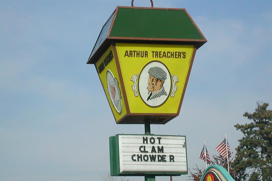
You won’t have seen this logo in a while unless you live in northeast Ohio, where there are still a handful of these fish and chip shops left. The signage is basically a yellow lamp post with a portrait of Arthur Treacher (an English actor who starred in Shirley Temple movies, and the restaurant’s spokesperson) wearing a checkered green hat and jacket. It could be found outside the front of Arthur Treacher’s 826 restaurants during its heyday in the 1970s.
Henry’s Hamburgers
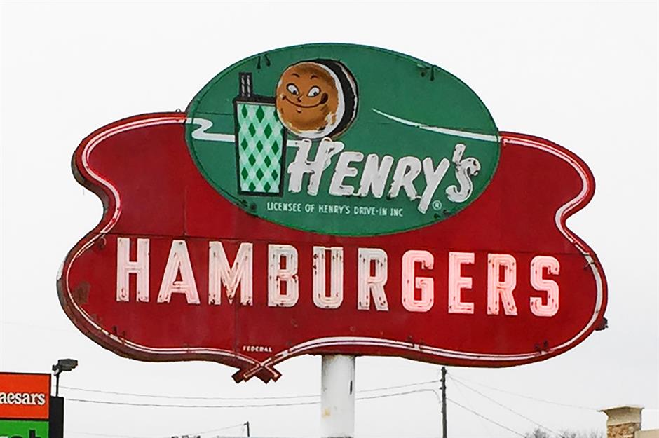
This smiling hamburger holding a cup and with a 'H' for a body meant one thing: Henry’s Hamburgers. The color scheme was green and red, and it signposted its 200 stores, which were coast to coast in the 1960s. Here, you could get chili dogs, fish sandwiches, deep-fried shrimp, and crispy catfish.
Burger King
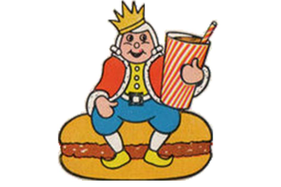
In 1957, Burger King’s logo was a jolly king mascot sitting on a burger and holding a drink. Underneath was the name followed by the slogan 'Home of the Whopper.' It lasted for 12 years, after which it was replaced by a burger with the restaurant’s name sandwiched between two buns.
Jack in the Box
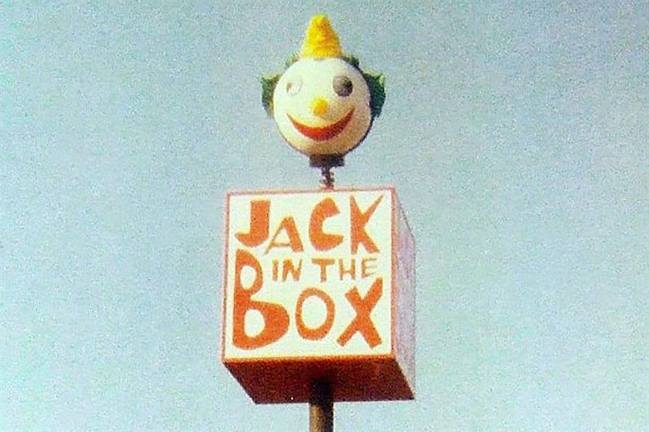
This wacky logo dates back to the 1960s, when Jack in the Box was circus themed. The box read 'Jack in the Box' in a red font, and was topped with a clown's head. Not creepy at all, then... The following decade, it shed its carnival branding in favor of a classy new update.
Little Tavern
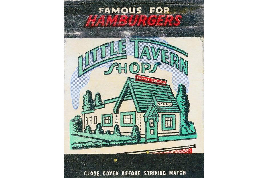
Opened in Louisville, Kentucky, in 1927, Little Tavern was heavily inspired by White Castle, and locations were instantly recognizable for their thatched green roofs. The logo, as seen here, was usually green and white, though occasionally it was red. The sketch of the building, though, was not part of the logo. The last remaining Little Tavern location, in Baltimore, Maryland, closed in 2008, though some of the buildings still stand.
Carl’s Jr
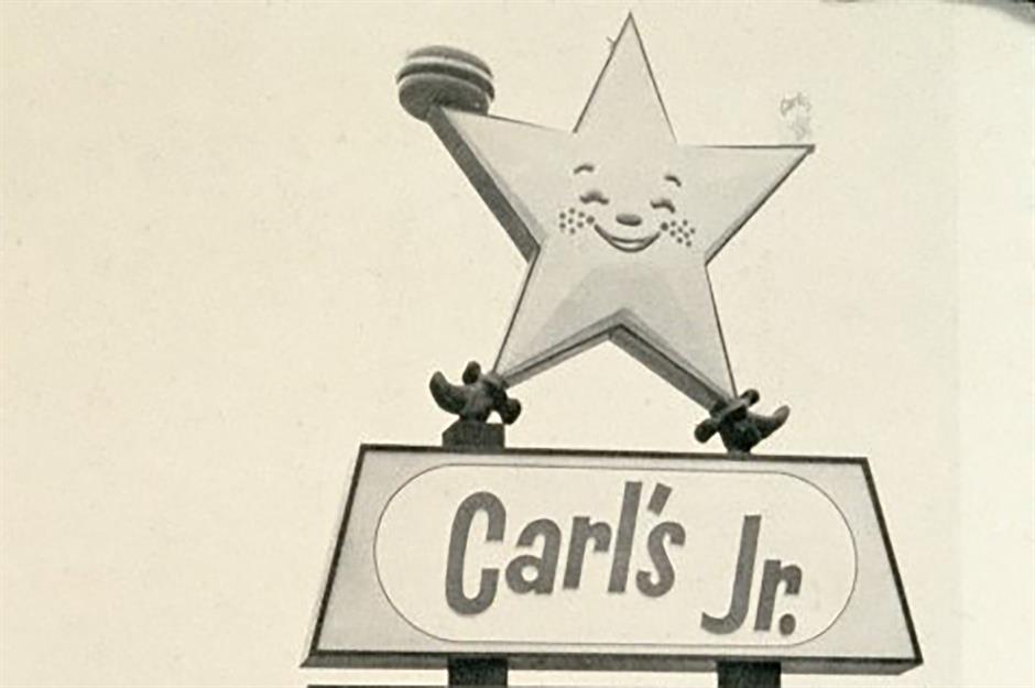
Though not completely different from the restaurant’s current logo, there are a few notable differences between the chain’s branding in the 1950s versus today. You can notice the star has more detail than usual, including freckles and feet, and is clutching a hamburger and drink.
Pioneer Chicken
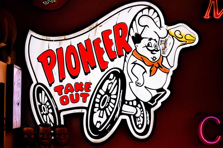
During the 1960s, there were signposts for regional chain Pioneer Chicken all over California. They featured a chicken wagon with 'Pioneer Takeout' on the side. It was driven by Pioneer Pete, who wore a hat and red scarf, had a moustache, and carried a piece of golden chicken. Nowadays, only two Los Angeles outposts remain, in Boyle Heights and Bell Gardens.
The All American Burger
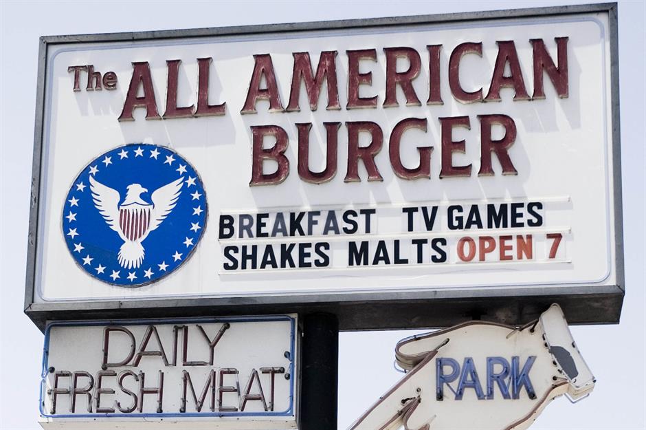
The blue logo of Californian chain The All American Burger could be spotted on its sign as well as its roof. It featured a white eagle with red feathers and little white stars around its border. It shot to fame when the restaurant appeared in the 1980s coming of age film Fast Times at Ridgemont High, however all of its outposts have long since been closed.
Pizza Hut
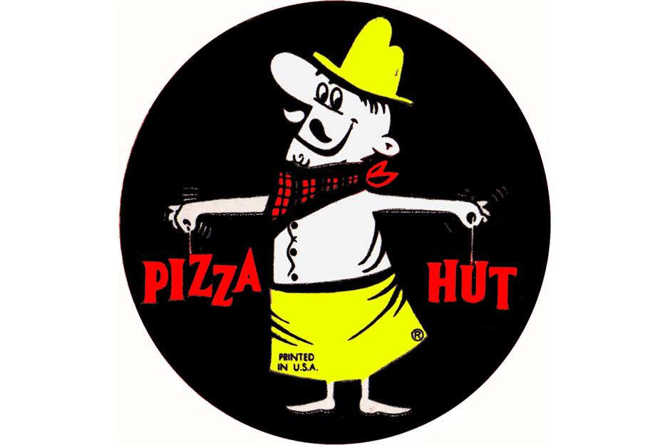
In Pizza Hut’s early years, its mascot was an Italian chef called Pizza Hut Pete. He sometimes appeared alongside the logo, which featured the name 'Pizza Hut' written in a jagged font. The immediately recognizable roof emblem we know and love today didn’t come along until the late 1960s.
Chi-Chi’s
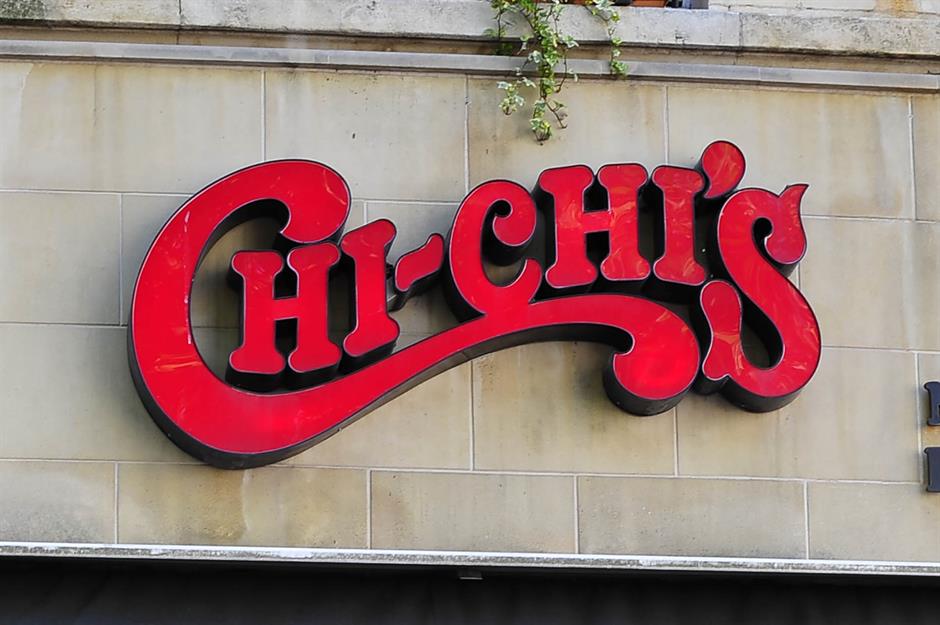
If you wanted Tex-Mex in the 1970s, you kept an eye out for the groovy red logo of Chi-Chi’s. The name of the restaurant was written in capitals and the curve of the 'C' underscored the text. Now closed in the US, if you want to try its chimichangas, nachos and salsa, you have to head to outposts in Austria, Kuwait, or the United Arab Emirates.
Dairy Queen
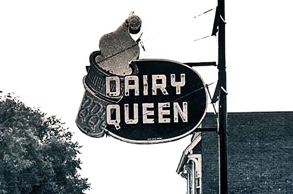
While the more recently updated restaurants are signposted by the initials 'DQ' on a red almond, you can occasionally see old (and sometimes defunct) branches carrying the restaurant’s original branding. 'Dairy Queen' was written out in full on a blue or red circle, with an ice cream cone positioned to the side.
Burger Queen
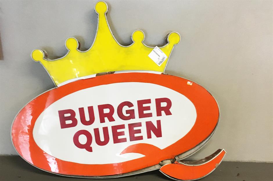
In the 1960s, Burger Queen restaurants began to pop up around Kentucky. Its logo was an orange 'Q' with the restaurant name written in the space in red and a yellow crown perched on top. It’s mascot Queenie Bee, a black and white bee, sometimes appeared beside it. In the 1980s, all the restaurants were changed to Druther’s.
Taco Bell
The chain is instantly recognizable from its purple-and-white (formerly pink) logo, but it has only been using these colors since the 1990s. When it was first launched, Taco Bell had multicolored branding on restaurant buildings and advertising from the 1960s to the 1980s, when each letter of 'Taco Bell' was written in a white sans-serif font on a different color square.
IHOP
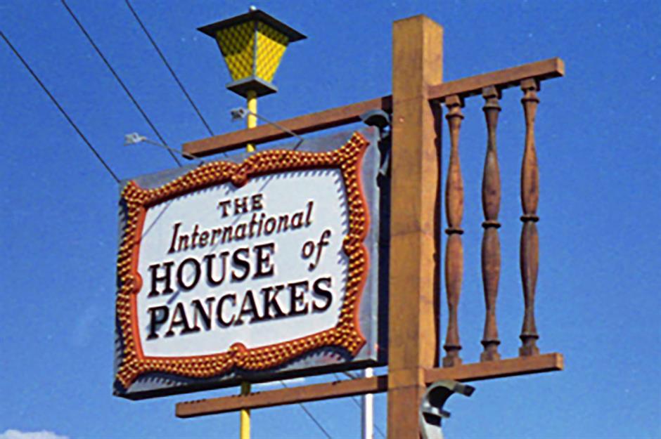
Most of us know IHOP stands for 'The International House of Pancakes' – but if you visited in the 1950s, when this was its signage, there would be no doubt. For a restaurant, the homely logo was relatively complicated, including an illustration of its wooden entrance and with a street-light and banner where its name was written. It was a world away from the minimalist acronym it uses today.
G.D. Ritzy’s
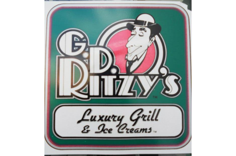
There were once 95 G.D. Ritzy’s across the eastern states, but now there are just a handful left. Some of the stores had a logo that featured a man in a bowler hat, a red circle, and the restaurant chain's name in bold typeface. Others had a different sign: just 'Ritzy’s' on a red background with a semi-circle above and below.
Farrell’s Ice Cream Parlour
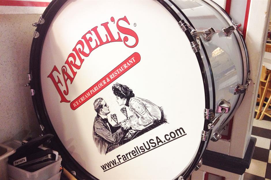
The ice cream parlor with epic sundaes, singing and drum-banging waiters, and kitschy decor, Farrell’s was established in Portland, Oregon, in 1963. The logo featured a couple holding hands across a table accompanied by milkshakes. 'Farrell’s Ice Cream Parlour & Restaurant' was written above in a red, Western-style font.
Denny’s
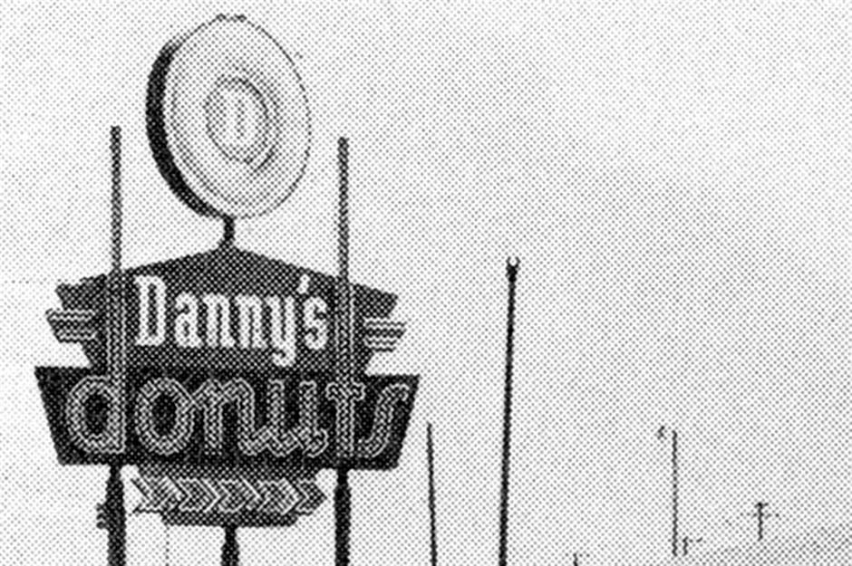
When Denny’s first opened in 1953, it was called Danny’s Donuts. The logo featured a pentagon with 'Danny’s' in white and 'donuts' below. The 'd' and 't' extended upwards like two posts. Below, there were arrows and on top a donut with the letter 'D' in its center. The name, and therefore the logo, changed to Denny's in 1959.
Check out these incredible American restaurants that have sadly closed for good
Comments
Do you want to comment on this article? You need to be signed in for this feature